Yesterday,
I was sipping my chai tea latte at Starbucks, while anticipating the long night
ahead (it being homecoming and all). While sitting at a table in the corner, I
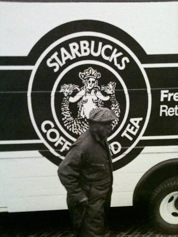
looked up and happened to see a black and white picture of an old Starbucks
delivery truck. What caught my eye was how different the logo on the truck was
compared to the current logo that Starbucks has. Here
are pictures of both:

The newer logo looks sleeker, cleaner and more classy. The older logo shows the woman's entire naked body, while the new logo is only from the shoulders up. In the old logo, the woman's breasts are exposed while in the new logo they are somewhat covered by her hair. Maybe a value that Starbucks has developed is modesty. Starbucks doesn't really have a whole lot of advertising, and maybe this is because they simply don't need it. They know that their products are good and that they will have no problem selling them. People seem to buy Starbucks no matter what.
In the new logo, her hair is very controlled and predictable, but in the old logo her hair is unruly and unkept. This could possibly suggest the reliability of Starbucks, and their hope that all products are appealing to the eye as well as the tastebuds. The new woman seems to be much thinner and happier. Maybe Starbucks, as a large corporation, cares about the health and well being of their costumers. The smile on her face is more profound than the old one. Obviously, Starbucks wants to sell products that their costumers enjoy. On the new logo, Starbucks added a star to her crown, possibly suggesting their superiority in the coffee business.
All of
these observations helped me infer about Starbuck's clientele, products and
service. They are a modest but predictable business, with high quality service
and standards. I guess you get what you pay for.

No comments:
Post a Comment